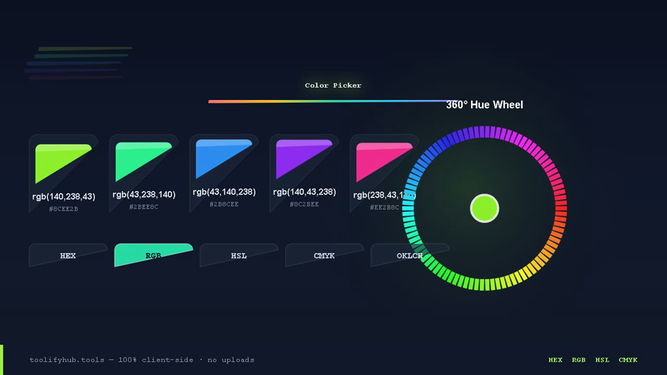
Why You Actually Need a Color Picker & Palette Generator
The Color Picker & Palette Generator provides frontend developers and UI/UX designers with a complete workstation for selecting, converting, and audit-testing colors locally in the browser.
Whether you are configuring Tailwind CSS 50–950 design tokens, verifying WCAG 2.2 AA/AAA contrast compliance, or simulating color vision deficiency, this tool provides instant decimal, hexadecimal, and wide-gamut OKLCH representations with zero server calls.
Why Use ToolifyHub.tools?
Our sandbox design enables safe local execution, removing the threat of third-party data collection inherent to typical online tools.
🔒 100% Privacy-First Sandbox
This tool runs entirely inside your browser. No files or inputs are sent to any external server.
❌ No Sign-Up or Accounts
Enjoy instant, anonymous access to all features without sharing email or credentials.
⚡ High-Speed Local Rendering
Optimized client-side rendering ensures near-zero processing wait times.
🎁 Free Forever with Zero Caps
Supported exclusively by simple display advertisements, keeping premium tools accessible to everyone.
How to Use the Color Picker & Palette Generator on ToolifyHub.tools
- 1
Pick a Base Color
Click anywhere on the interactive color preview box to launch the native color picker, or click "Pick from Screen" to sample any pixel from your display.
- 2
Inspect Synchronized Formats
View synchronized HEX8, RGBA, HSLA, CMYK, and modern OKLCH (CSS Level 4) values displayed in individual code boxes with 1-click clipboard copying.
- 3
Audit WCAG 2.2 Contrast
Evaluate your color's contrast against pure white (#FFFFFF) and pure black (#000000) surfaces with real-time pass/fail badges for AA (4.5:1) and AAA (7.0:1) standards.
- 4
Generate Tailwind CSS 50–950 Shades
Scroll to the Tailwind Scale Generator to inspect the 11-step shade palette and click "Copy Tailwind Config" or "Copy CSS Vars" to export design tokens.
- 5
Simulate Color Blindness & Copy
Test how your color appears under Protanopia, Deuteranopia, Tritanopia, and Achromatopsia, then copy any code format with one click.
Real-World Scenarios Where This Saves You
🎨 Designing Accessible Brand Theme Systems
A product designer is building a new design system in Figma and Tailwind CSS. She picks a brand primary blue (#3B82F6), checks its HSL lightness, and uses the Tailwind 50–950 generator to create 50, 100, 500, 700, and 900 shade variants for hover states, card backgrounds, and active borders.
💻 Customizing Tailwind CSS Configuration
A frontend engineer is initializing a Next.js project and configuring tailwind.config.ts. He inputs raw RGB client specifications into the picker, generates exact HEX equivalents, and exports the full 11-step brand palette with one click.
📱 Optimizing Mobile Dark Mode Surfaces
A mobile developer is creating a dark mode theme. Instead of using harsh pure black (#000000), he selects a deep slate tone (#0F172A), uses the palette builder to extract secondary accents, and verifies readable text contrast against WCAG AA standards.
Common Mistakes to Avoid
How We Tested This Tool
To guarantee complete accuracy and reliability, our engineering and QA team validates the Color Picker & Palette Generator regularly against:
- Cross-Browser Compatibility: Verified on standard releases of Google Chrome, Apple Safari, Mozilla Firefox, and Microsoft Edge.
- Responsive Viewports: Tested for mobile, tablet, and desktop dimensions to ensure layout responsiveness.
- Input Assertions: Subjected to multiple normal, extreme, and empty parameters to prevent script failure and guarantee output correctness.
Local Browser Sandbox vs. Cloud Tools
| Metric | ToolifyHub Sandbox | Typical Cloud Services |
|---|---|---|
| File Upload Risks | None (0% upload rate) | High (transmits data to remote servers) |
| Execution Cost | Free forever (No limits) | Subscription-gated or limits applied |
| Data Retention Policy | Immediate deletion on page close | Retained in cloud buckets or server logs |
| Processing Latency | Sub-second client execution | Network upload & queuing delays |